Responsive Design: Why it matters

Responsive Design: Why it matters
Did you know that the size of the screen and the method of content input have a significant impact on how visitors engage with your site?
A couple of years ago Microsoft predicted that mobile would overtake non-mobile internet usage in 2014. Whilst it’s evident from the results below that mobile marketing is now more important than ever before, it’s also important to understand how consumers behave when using different types of mobile devices and what their preferences are.

Mobile phones are changing how users engage and interact online, but many businesses are not changing their marketing strategies to accommodate their audience. Ignoring responsive web design is a fatal mistake for any business and can leave an everlasting bad impression. The fact is, if you are unable to create a mobile friendly design then 9 times out of 10 your client will go to a competitor who can offer them one.
Responsive web design ensures a positive user experience across multiple devices which can then evolve into higher traffic, better sales and a stronger overall web presence in the market.
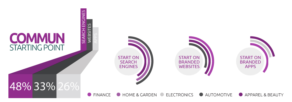
How clients research products using mobile search and review sites
Google recently surveyed 950 US consumers across 9 different verticals to analyse exactly how they researched purchases with their mobile device. An important finding was the starting point for mobile research with search being the significant starting point. However, search is lower than desktop showing the importance of branded apps and mobile sites.
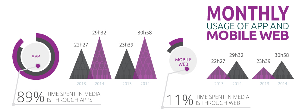
Monthly usage of mobile web vs app
Another important factor to consider when planning our mobile marketing strategy is consumer preference for mobile apps vs mobile sites. The data below by Nielsen on mobile media time displays the client’s preference to mobile apps which account for over 89% media time in mobile such as popular social networks, emails and news apps.
How do I make a design responsive?
In order to make a design responsive, you must consider how different devices are going to display your design and how users will react to your particular design. You will need to create an appearance that’s flexible and can deliver complementary layouts for the various screen size options while maintaining your brand integrity.
You should create a code and add media queries, which are pieces of code that analyses the size of the screen being used to display the appropriate design and content on that particular screen. Please remember that everything will need to change from the image size to the navigation structure in order to provide a positive viewing experience.
Do not be mistaken in thinking that one-size-fits-all because it’s merely about being advantageous with the new opportunities arising by new technologies. Responsive web design requires careful planning and dedication but the rewards are worth it with a flexible site that works well with smartphones as well as desktop.
With user engagement being so reliant on smartphones and desktop devices, now is the time to utilise responsive design to allow your website to display its content on different devices without sacrificing user experience.